
The Secret Metric Behind Perfect Packaging Colours
Have you ever walked down a retailers aisle and noticed that one box looked slightly faded compared to the ones next to it? Your brain instantly flags it. You might wonder: Is this a knockoff? Is it expired? Has it been sitting in the sun?
In the packaging world, colour consistency equals brand trust. But because human eyes see colour differently based on lighting, age, or fatigue, the printing industry doesn’t rely on human sight alone.
Instead, high precision packaging manufacturers rely on a single mathematical number: Delta E (ΔE).
What is Delta E?
Delta E is a metric used to calculate the exact difference between two colours. The “Delta” (Δ) stands for the difference, and the “E” stands for Empfindung, the German word for sensation or feeling.
Essentially, Delta E answers a critical question: How far away is my printed colour from my target colour?
Instead of guessing (“It looks a bit too blue”), a press operator uses a spectrophotometer to measure the light reflecting off the printed sheet. The device then calculates a definitive Delta E score based on the global CIEDE2000 (ΔE00) standard.
- 0 (ΔE = 0) means a completely perfect, identical match.
- The higher the number, the bigger the colour mistake.
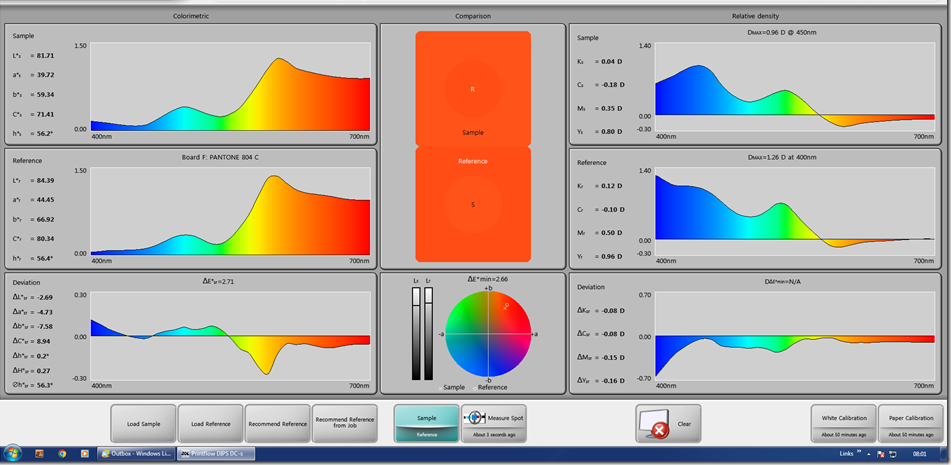
The Delta E Cheat Sheet: What Do the Numbers Mean?
How big of a difference does the number actually make? Here is how the human eye registers Delta E scores on a retail shelf:
- Under 1.0: Invisible. The human eye cannot see any difference at all.
- 0 to 2.0: Barely noticeable. Only a trained colour expert or graphic designer might spot it under specific lighting.
- 0 to 3.5: The industry standard. This is the typical “pass/fail” tolerance for commercial packaging. A regular shopper won’t notice a variation in this range.
- 5 to 5.0: Noticeable. A consumer looking closely will see that the colours don’t quite match.
- Above 5.0: Obvious error. The product looks defective, old, or poorly made.
Why Is Delta E the Ultimate Tool for Packaging?
Managing colour in packaging is uniquely difficult. A single brand might print its logo on a carton in the UK, a plastic pouch in China, and a glass bottle label in Europe.
Delta E makes global quality control possible by removing the guesswork:
- It Creates a Universal Language: Brands can give a printer a specific digital colour target and say, “The final print must be within a Delta E of 2.0.” No matter the language or location, the factory knows exactly what success looks like.
- It Saves Time and Money: Printers can measure the ink colour at the very start of a production run. If the Delta E is tracking too high, they can fix the ink formulation immediately before wasting thousands of sheets of expensive packaging material.
- It Protects Brand Identity: For iconic brands, their colour is their trademark. Keeping the Delta E low ensures that a product looks fresh, authentic, and high-quality on every shelf worldwide.
Conclusion
In retail packaging, colour isn’t just decoration, it is the very first handshake between your product and your customer. By replacing subjective opinions with precise Delta E science, high-quality litho printing ensures your brand always looks exactly the way you engineered it to look.
Discover more of our quality design services for your new packaging today.